A Kitchen Reimagined
Blending Old with New for a Seamless, Sophisticated Space
At Hubley Painting & Remodeling, we believe that great design doesn’t always mean starting from scratch. Sometimes, the most thoughtful transformations come from working with what’s already there—and knowing how to make it better. This recent kitchen project is a perfect example of that approach.
Our clients loved the bones of their kitchen but knew it wasn’t functioning well for their growing family. Some parts felt crowded, others underutilized, and the overall layout lacked balance. Instead of tearing everything out, we took a smarter route: we reimagined the existing cabinetry—reshuffling where it made sense—and introduced new elements where needed. The result is a space that feels cohesive, elevated, and built to support the rhythm of daily life.
Elevating with Crown and Clean Lines
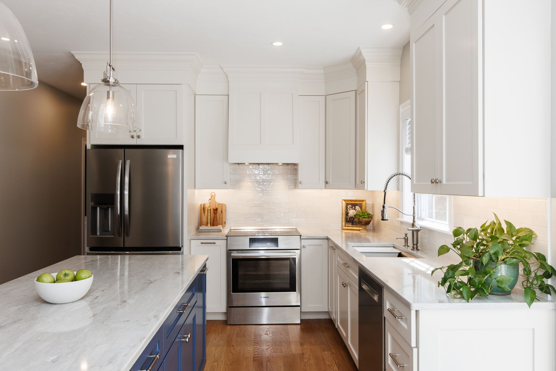
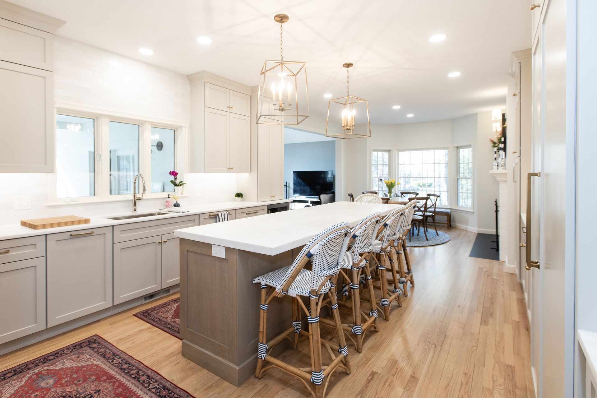
One of the first visual changes we made was adding crown molding to the tops of the upper cabinets. It’s a subtle detail, but one that makes a big impact—bringing the cabinets all the way up to the ceiling gave the entire space a more polished, finished look. It draws the eye upward, adding a sense of height and elegance.


A New Focal Point Over the Cooktop
Previously, the area above the cooktop featured decorative open shelving that didn’t serve much function and felt disconnected from the rest of the design. We removed it and built a custom range hood—something that not only adds proper ventilation but also anchors the kitchen with a beautiful focal point. It's now one of the first things you notice when you enter the space, and it sets the tone for the kitchen’s blend of style and substance.
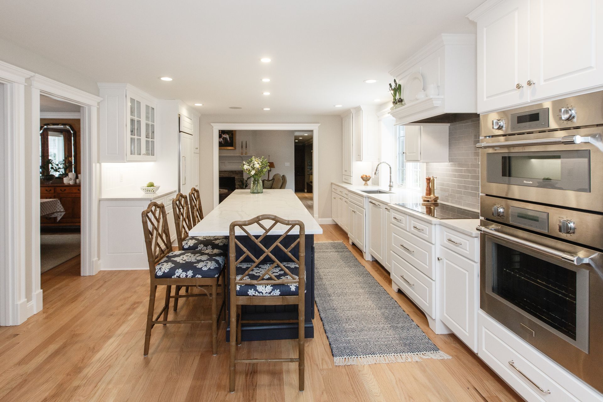
A More Functional - and Beautiful - Island
The island, while centrally located, didn’t quite fit the space. It felt undersized and the overhang for seating left the stools awkwardly clustered. We extended the island to better match the scale of the room and added more storage and workspace in the process. Now, seating runs the full length of the island, offering plenty of elbow room for meals, homework, or casual conversation. To warm up the space and add visual interest, the homeowners chose to keep the island in its natural wood finish. That natural element was thoughtfully echoed in the trim detail of the custom stove hood, tying the two focal points together and creating a cohesive, inviting look.


Creating Balance and Flow with Cabinetry
One of the trickiest areas in the old kitchen was the wall with the built-in desk. Flanked by a large pantry cabinet on one side and the refrigerator on the other, the layout felt heavy and visually off-balance. To fix this, we relocated the pantry to the far end—where the desk used to be—and filled in the space between it and the fridge with functional base and glass-front upper cabinets. This not only balanced the tall, weighty pieces, but also gave the family more usable counter space and elegant display storage. To the right of the fridge, we added another bank of cabinets, uppers and lowers, for even more smart storage.


Adding Character to the Eating Nook
In the adjacent eating area, an existing brick fireplace felt a bit off-center and out of place. We added brick to center it and painted the whole thing in Benjamin Moore Cloud Cover, the same shade as the surrounding walls. The result is a cozy, charming feature that grounds the nook with character and warmth, while still feeling clean and cohesive.


Thoughtful Design Selections
Of course, a remodel wouldn’t be complete without beautiful finishes—and the homeowners made some stunning choices. The countertops are Bianco Rhino marble, soft and elegant with just the right amount of movement. Cabinets were painted Benjamin Moore Revere Pewter, a timeless greige that pairs beautifully with the artisan white tile backsplash. Fixtures include the polished nickel Edalyn kitchen faucet by Kohler, and for hardware, they selected the Kara knob and Ascendra pull from TopKnobs, both in a warm honey bronze finish.


This kitchen now functions beautifully for the family who calls it home—and it does so with style. It’s proof that with the right design approach, a thoughtful mix of old and new can feel entirely fresh.